Lame.
Category Archives: photoshop
Bad type
I’d like to take a minute to share a little Photoshop trick I picked up a while back. One of the main duties of my job is to take designs done in Illustrator or Photoshop and turn them in to functional websites. This means that I’m often the person responsible for taking graphical elements out of the comps our designers hand me and making those fit in the XHTML.
So when I see something like this on a website, it makes me cringe (screenshot from eBay’s homepage today):

This is a classic example of what happens when you let your intern make graphics. I added the circles to point out the particularly bad areas in case you aren’t typographically inclined. Photoshop does a terrible job of kerning your small type, and when it’s not anti-aliased, the problem areas stand out much more.
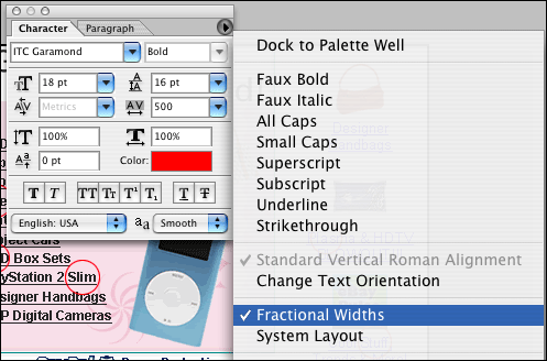
How do you fix it? You could make them go back and manually adjust the spacing between each letter pair until it looks perfect, which could take hours… Or, you could select your type, and in the Character palette in Photoshop turn off the “Fractional widths” option (screenshot below).

This will give you nicely spaced type at small sizes. It’s perfect for making those buttons with the non anti-aliased Verdana type that we have all had to make 20 times in our careers.
Yes, it’s that simple. Now go fix your type.